Appaltracker
Fall 2025
UI / UX, visual identity
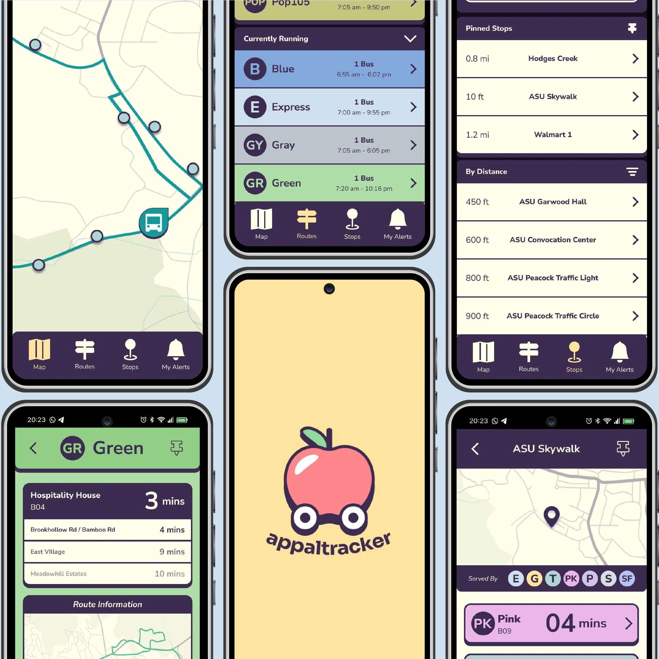
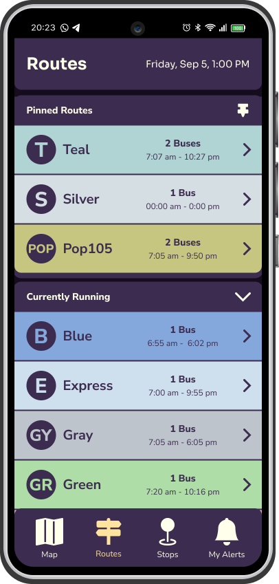
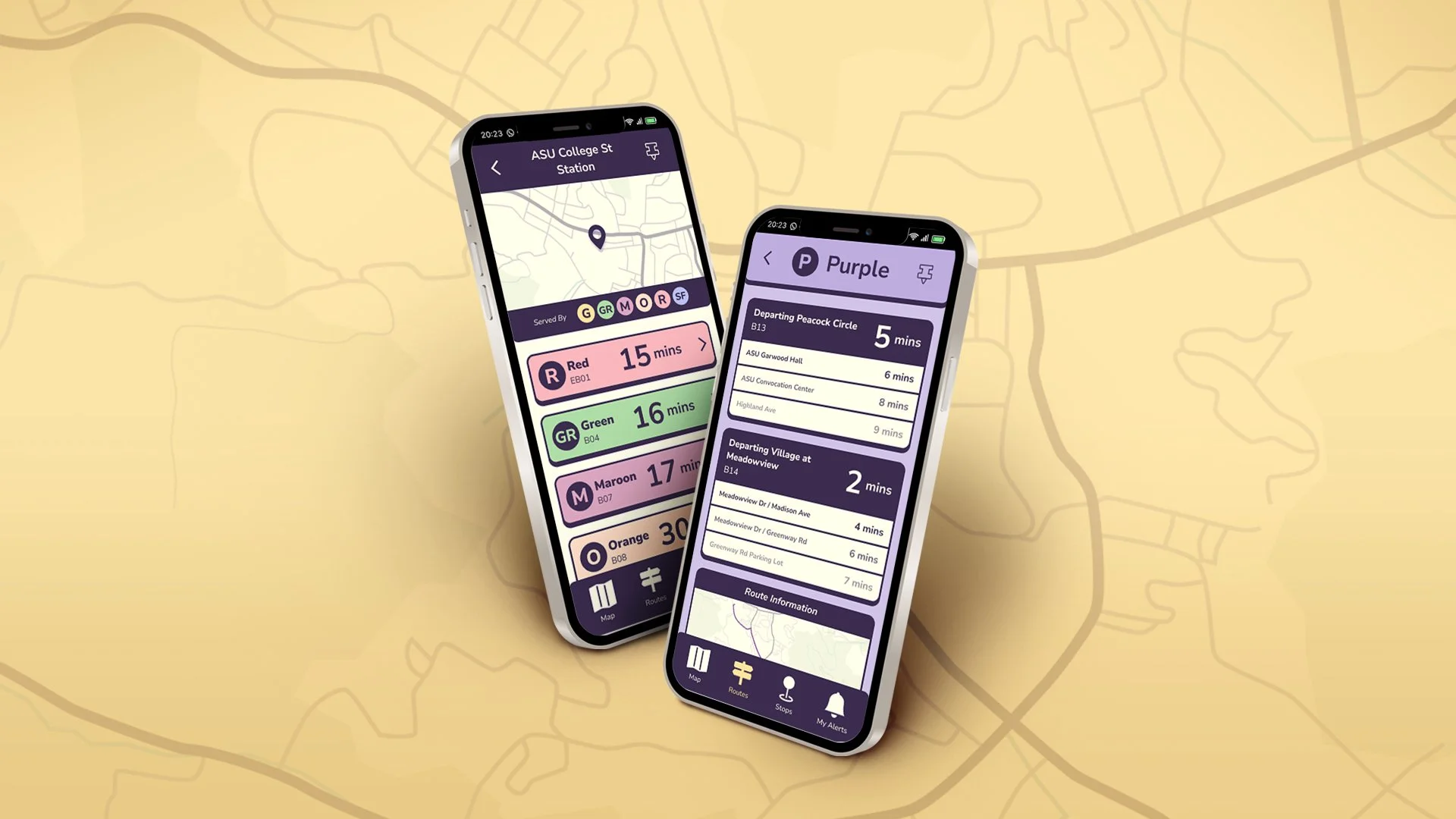
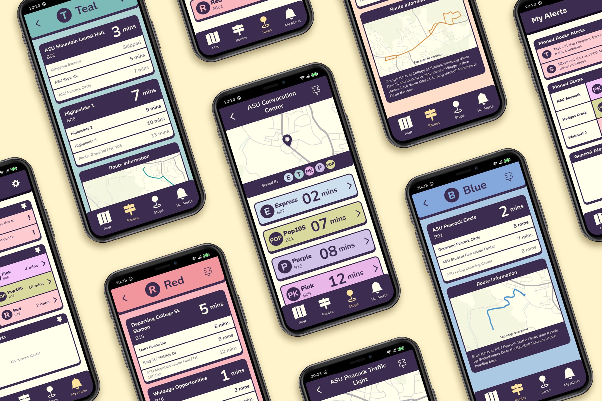
Appalcart is the free public bus system providing service to Boone, NC, primarily serving the student population of Appalachian State University during the academic year. Appalcart utilizes a third-party tracking app, ETA SPOT, which is notorious among riders for its poor visuals, numerous glitches, and overall poor user experience.
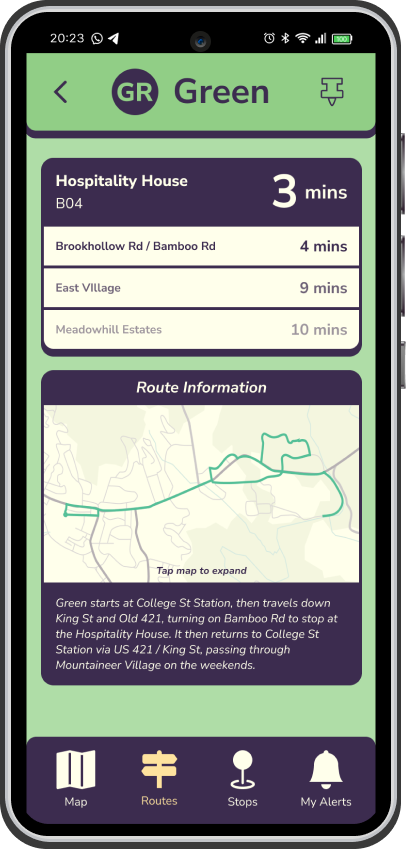
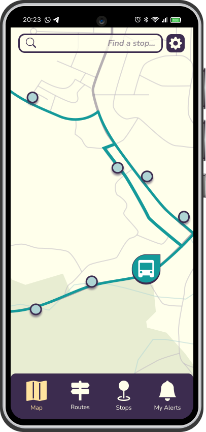
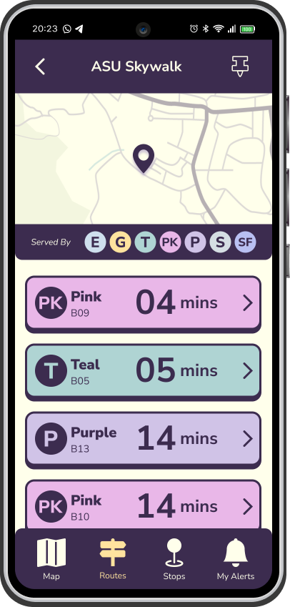
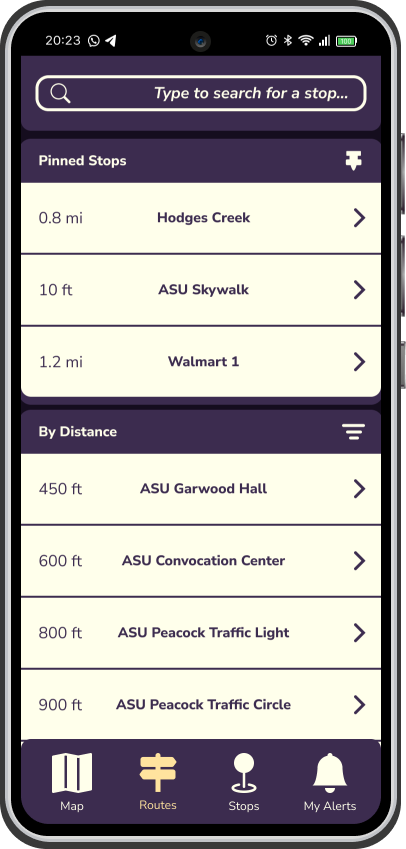
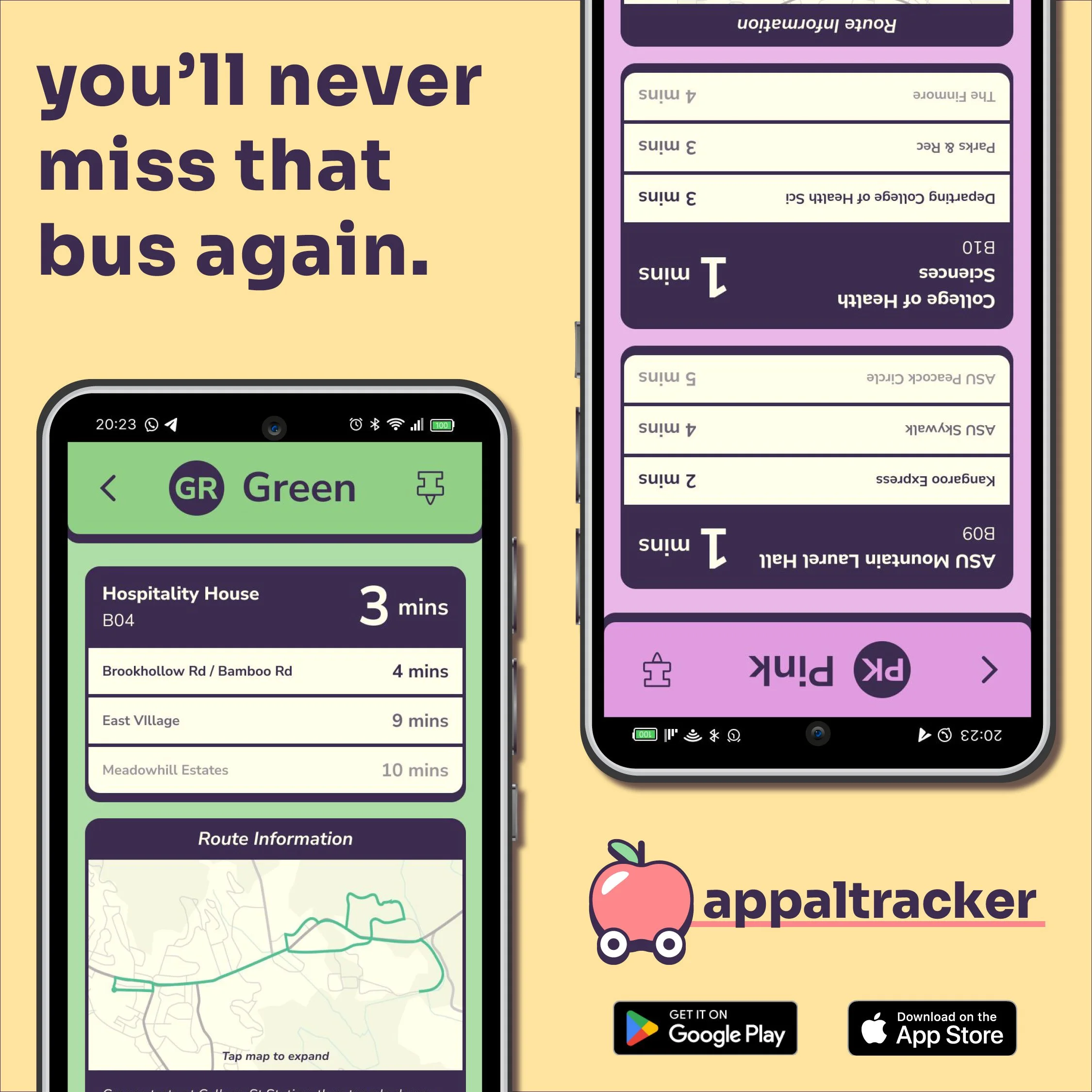
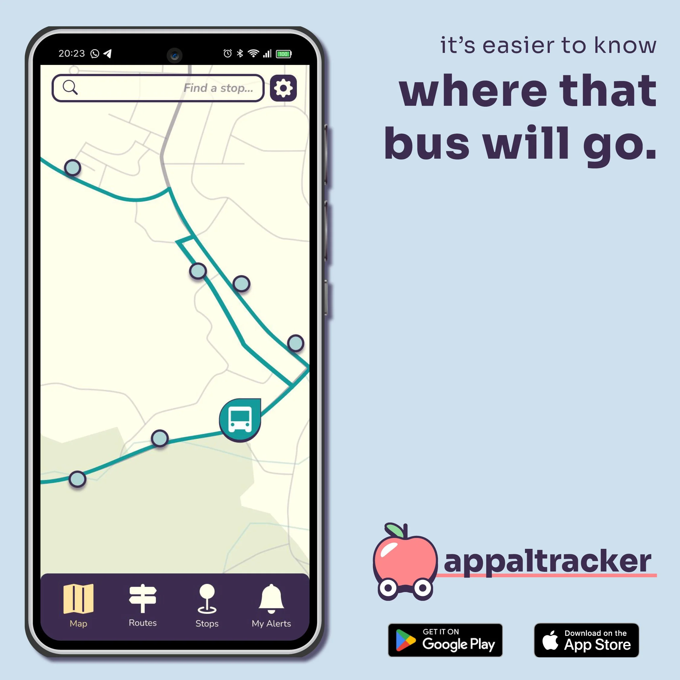
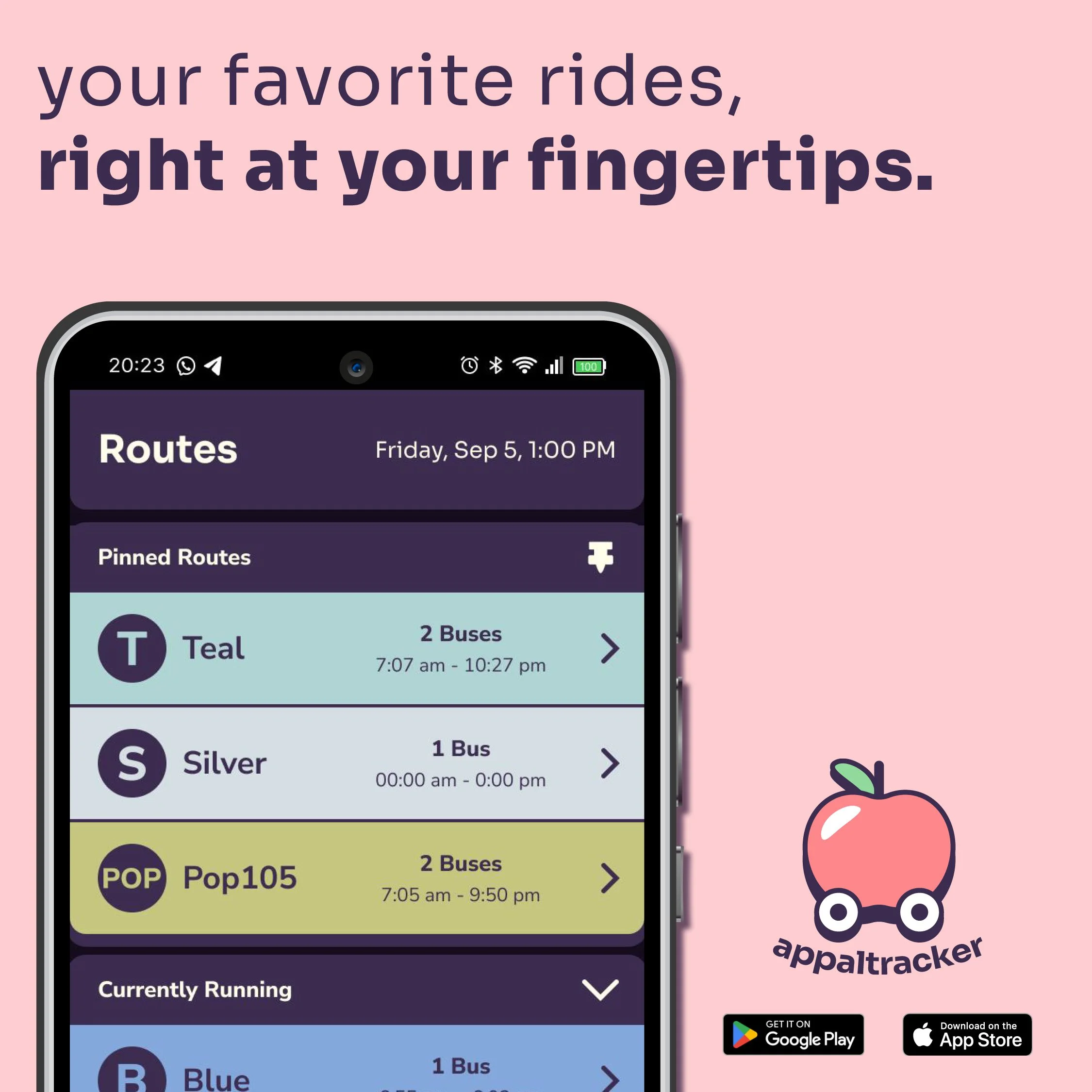
As my first senior capstone project, I created a concept for a redesigned tracking app, aiming to improve upon the visuals and flow of the Appalcart tracker. Many of the visual issues of SPOT are due to the amount of clutter, poor usage of space, and minimal usage of color in its interface. Appaltracker’s stronger text hierarchy and color usage makes information easier to parse in a hurry, as users can quickly identify which times belong to which route just by glancing at the color and icon. The ability to pin frequently used routes and stops also streamlines the user experience, reducing the need to scroll through any information that may not be relevant to a specific rider’s regular commute.
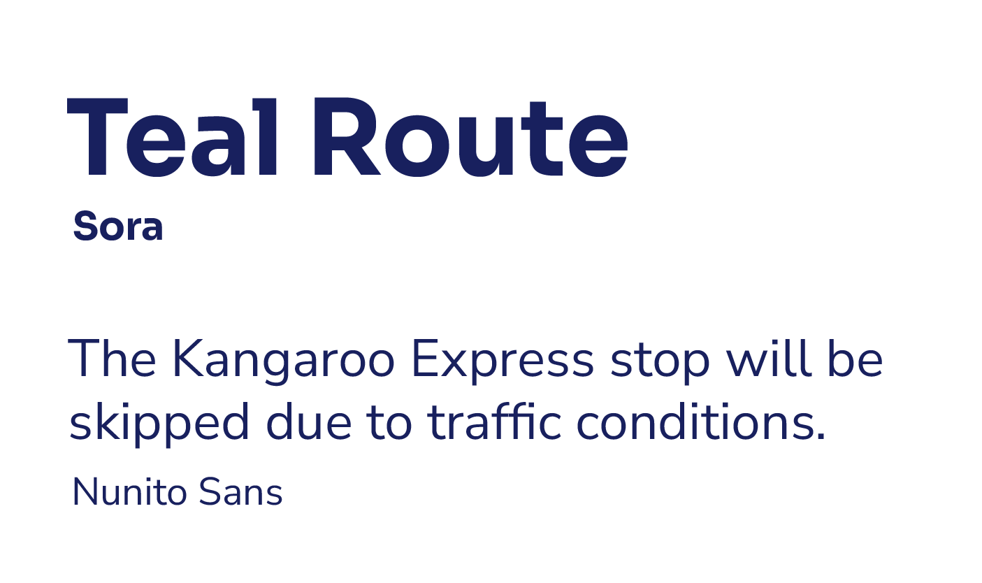
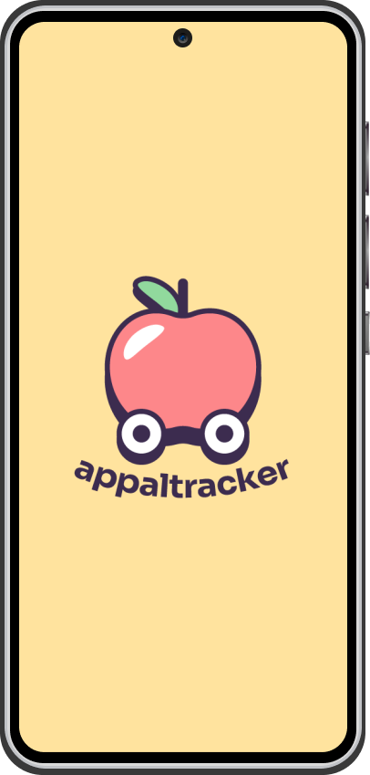
Appaltracker’s visuals draw from the “Neo-brutalist” style, with bright but not overwhelming colors. The goal is to feel retro, but in a cool, not outdated feeling way. A more modernized logo uses solid outlines and soft, simple shapes to feel approachable and fun. This refreshed visual identity creates more appeal for the student audience, but doesn’t ostracize the other audience of local and older riders. Most importantly, the type remains accessible to all through the use of clean typefaces and color contrast.
Primary mark
Secondary mark